Seattle Art Museum, June 27–September 8, 2013 and moving to a few other places in future
Overall, this was a very interesting collection with beautiful and interesting garments, most of which were displayed very well. The exhibit started us out easy with evening gowns in dark colors -- the "In Praise of Shadows" room -- but I can't speak to the rest of the intended presentation because we pretty clearly went through it backwards. They definitely made an excellent move by having a small area showing videos of European and American designers' work around the same time to let viewers understand the historical context of the Japanese folks' groundbreaking work. There was a good, broad selection of materials and shapes, and an appropriate focus on earlier works by the major designers in the 1980s, since that's when Japanese fashion seems to have had a big pushback against and influence on haute couture.
One major disappointment was the exhibit's booklet, which has exactly ONE page about anything in the show. I also think it was a big mistake to project videos of fashion shows in the same room with the displayed garments: I understand space limitations and the logical impulse, but what it led to was people standing immobile in rooms, not in the middle because they would block the projection, therefore directly in front of where you'd need to stand to see the clothes. They needed to at least alter the display method.
Lots of commentary on designers and pieces below, not nearly exhaustive but not at all short, so
Rei Kawakubo -- great stuff.
Collection "Dress Meets Body, Body Meets Dress"
Dramatic changes to silhouette brought on by stuffed and padded blobs in the garments. I wasn't crazy about most of the fabric choices, and despite the hunchbacking and exaggeration of hip and belly almost all of the clothes accentuated a slim-feminine torso and breasts. The rejection of most forms of beauty and expectation was really great, though.
Another collection that I loved was Kawakubo's stuff that was displayed flat, making one interesting shape, and then draped on mannequins for a completely different shape. Some were more curved, or blocky, or layered when flat, and it was really interesting to see how the artist was designing for two dimensionalities at once. These garments were presented well overall, though maybe due to space constraints the 2D and 3D displays weren't always very close together -- kind of a fun scavenger hunt, but counterintuitive enough that it was possible to miss the point for a while.
(also the person behind Comme des Garcons)
Yohji Yamamoto -- my favorite.
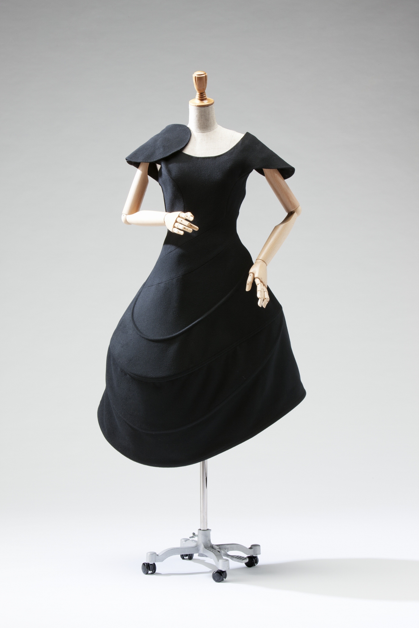
Gorgeous gowns, a sure way to my heart. The best was a 1990-91 season black wool dress with utter perfection of curve, a continuation of the same graceful shape across both shoulders and echoes of it in the skirt. (Almost don't want to link the photo because it doesn't represent it well at all, but here.)
Links to his work: http://www.styleclicker.net/2011/04/03/all-i-wanted-was-for-women-to-wear-mens-clothes-yohji-yamamoto-at-the-va/
http://www.strawberige.com/2011/02/white-effect.html (The Spring 1998 dress was in the exhibit, and is beautiful and wearable.)
Issey Miyake is excellent but so much in my own internal(ized?) idiom that most of his work seems like, well of course. The exception was the collection 132.5: folded flat forms like concentric rotating squares, which could be worn as diagonally pleated dresses: displayed were a white one with annoying mountain-and-valley lines printed on, one black one not that interesting, one black one with screened-on metallics in the folded state BRILLIANT. http://www.pleatfarm.com/2010/10/06/origami-inspired-issey-miyake-132-5/
Aya Takano, a Superflat artist, had a print on a beautiful round cape with piping held out from the edge of the garment, and on rain boots. Part of the collection she did with Miyake, it seems. Note the mochi-making moon bunny! (She has also collaborated with Shu Uemura on makeup, and it was adorable.)
Hiroaki Ohya (2004) had an Astro Boy @ symbol as part of an Astro Boy-themed outfit, which was a lot of fun. Strangely, while Astro Boy is more recognizable, the curators had seen fit to name him and Hello Kitty on their placards, but Lum was merely "manga character." It's like they don't understand what information is.
Kosuke Tsumura (2012) had a coat made entirely of clear-plastic pockets, intended as urban survival gear, but Wim and I were both really taken with the way it was displayed: all the pockets full of silk flowers, which were spilling out onto the floor.
Junya Watanabe has a lot of pleated plastic that looked like tissue-paper party decorations and that I didn't find very interesting -- this one being the best -- but also a couple of great things. First, a fragmented floral Southern-belle dress held together with backpack straps, where I thought the subtlety of the construction and small skin-baring overlap-gaps would have been enough, but he'd also seen fit to add giant panniers. It was also paired with an amazing hat constructed around a tornado of wire armature, which fascinated Wim, and me once he pointed it out. The second thing of his I really liked was a slim-fitting parka-ballgown, which had great use of bright colors and was generally lovely and hilarious.
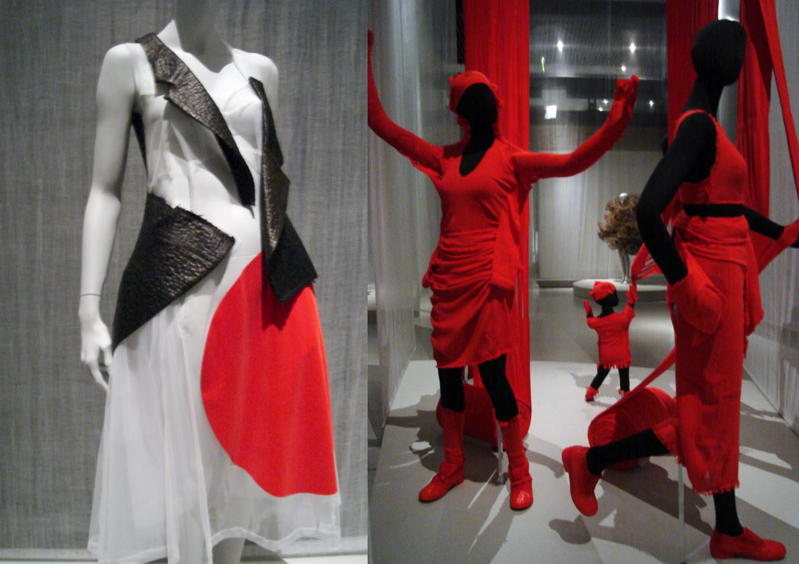
I have mentioned before the crane dress (left), which I didn't write down the designer for because I was TOO MAD. On the white skirt was a huge, intense crimson dot, and the bodice was sheer white with chunks of some awful, snakeskinny black pleather suit-jacket from the depths of an 80s cocaine binge. So, fun, beautiful, DIY-inflected -- and then, the way they came together somehow gave me the impression of a dancing crane. No one who had played Okami could have mistaken it. And, just, really, curators? The placard said pretty much just "rising sun motif." That's how they knew it was Japanese! Have you ever seen any art anywhere, though? That's not ALL. And the Americans who haven't played Okami were not seeing it, they had this shallow view: you have to GIVE them cultural referents, otherwise it reads like LOL those wacky foreign designers putting their flags on stuff.
Another image of this great dress to make up for my failure, and that of everyone else I can find on the internet, to credit it properly: I am not happy with how they styled it (wtf makeup!), but here the dress adorably looks like All The John Hughes Movies Ever.
(So I guess just ranting to Wim at the time didn't satisfy me as much as I thought, huh? Moving on.)
Possibly the best part of the exhibit was that they included with self-evident justice two complete outfits from Baby, The Stars Shine Bright. (One Sweet Lolita and one more gothic, of course.) It was over with the Hello Kitty and stuff, which is fine because it's clearly popular fashion, but it had the biggest presence in that room. And I had tears in my eyes. Because of Kamikaze Girls, and Nana, and all the other associations I have. Mostly because it was respect for the thing BTSSB does, which I have been trying to pull apart some since then. (I mean, a form of respect, I don't actually think they have a complex interpretation of it based on the rest of the exhibit, but. The Isobes' clothes are in the damn art museum.)
So, when I thought about it, I decided that what I perceive BTSSB as doing is feminist gender subversion. Quit laughing. :) Now I realize this gets away from Kamikaze Girls a bit, because Momoko is immersed in her love for it in a way that doesn't seem all that self-aware, but bear with my privileged lens for a minute. Almost all girls are told that this sugar-and-spice business is what they are. You are to be frilly and cute and usually trivial: it's your nature. So who could blame you for falling into it? People do. But what if you choose it? Not "I would die for Rococo" so much, but playing in the space given to you, choosing to own it and invest yourself there, to meet people's expectations so damned thoroughly that they become uncomfortable. It's not gender play exactly, but it is femme as fuck. And femme is important to me. At least, it is now that I'm done having the completely opposite reaction of fighting off imposed femininity with a gender-neutral pitchfork.
Also there was a white-bunny purse with red eyes that took the pink outfit in a delectably creepy direction, loved that.
Other reviews:
Jen Graves, The Stranger
Moira Macdonald, Seattle Times
Evelyne Politanoff, Huffington Post
Fashion and Sarcasm on the Barbican instance of the exhibit, which had some stuff ours didn't
Overall, this was a very interesting collection with beautiful and interesting garments, most of which were displayed very well. The exhibit started us out easy with evening gowns in dark colors -- the "In Praise of Shadows" room -- but I can't speak to the rest of the intended presentation because we pretty clearly went through it backwards. They definitely made an excellent move by having a small area showing videos of European and American designers' work around the same time to let viewers understand the historical context of the Japanese folks' groundbreaking work. There was a good, broad selection of materials and shapes, and an appropriate focus on earlier works by the major designers in the 1980s, since that's when Japanese fashion seems to have had a big pushback against and influence on haute couture.
One major disappointment was the exhibit's booklet, which has exactly ONE page about anything in the show. I also think it was a big mistake to project videos of fashion shows in the same room with the displayed garments: I understand space limitations and the logical impulse, but what it led to was people standing immobile in rooms, not in the middle because they would block the projection, therefore directly in front of where you'd need to stand to see the clothes. They needed to at least alter the display method.
Lots of commentary on designers and pieces below, not nearly exhaustive but not at all short, so
Rei Kawakubo -- great stuff.
Collection "Dress Meets Body, Body Meets Dress"
Dramatic changes to silhouette brought on by stuffed and padded blobs in the garments. I wasn't crazy about most of the fabric choices, and despite the hunchbacking and exaggeration of hip and belly almost all of the clothes accentuated a slim-feminine torso and breasts. The rejection of most forms of beauty and expectation was really great, though.
Another collection that I loved was Kawakubo's stuff that was displayed flat, making one interesting shape, and then draped on mannequins for a completely different shape. Some were more curved, or blocky, or layered when flat, and it was really interesting to see how the artist was designing for two dimensionalities at once. These garments were presented well overall, though maybe due to space constraints the 2D and 3D displays weren't always very close together -- kind of a fun scavenger hunt, but counterintuitive enough that it was possible to miss the point for a while.
(also the person behind Comme des Garcons)
Yohji Yamamoto -- my favorite.
Gorgeous gowns, a sure way to my heart. The best was a 1990-91 season black wool dress with utter perfection of curve, a continuation of the same graceful shape across both shoulders and echoes of it in the skirt. (Almost don't want to link the photo because it doesn't represent it well at all, but here.)
Links to his work: http://www.styleclicker.net/2011/04/03/all-i-wanted-was-for-women-to-wear-mens-clothes-yohji-yamamoto-at-the-va/
http://www.strawberige.com/2011/02/white-effect.html (The Spring 1998 dress was in the exhibit, and is beautiful and wearable.)
Issey Miyake is excellent but so much in my own internal(ized?) idiom that most of his work seems like, well of course. The exception was the collection 132.5: folded flat forms like concentric rotating squares, which could be worn as diagonally pleated dresses: displayed were a white one with annoying mountain-and-valley lines printed on, one black one not that interesting, one black one with screened-on metallics in the folded state BRILLIANT. http://www.pleatfarm.com/2010/10/06/origami-inspired-issey-miyake-132-5/
Aya Takano, a Superflat artist, had a print on a beautiful round cape with piping held out from the edge of the garment, and on rain boots. Part of the collection she did with Miyake, it seems. Note the mochi-making moon bunny! (She has also collaborated with Shu Uemura on makeup, and it was adorable.)
Hiroaki Ohya (2004) had an Astro Boy @ symbol as part of an Astro Boy-themed outfit, which was a lot of fun. Strangely, while Astro Boy is more recognizable, the curators had seen fit to name him and Hello Kitty on their placards, but Lum was merely "manga character." It's like they don't understand what information is.
Kosuke Tsumura (2012) had a coat made entirely of clear-plastic pockets, intended as urban survival gear, but Wim and I were both really taken with the way it was displayed: all the pockets full of silk flowers, which were spilling out onto the floor.
Junya Watanabe has a lot of pleated plastic that looked like tissue-paper party decorations and that I didn't find very interesting -- this one being the best -- but also a couple of great things. First, a fragmented floral Southern-belle dress held together with backpack straps, where I thought the subtlety of the construction and small skin-baring overlap-gaps would have been enough, but he'd also seen fit to add giant panniers. It was also paired with an amazing hat constructed around a tornado of wire armature, which fascinated Wim, and me once he pointed it out. The second thing of his I really liked was a slim-fitting parka-ballgown, which had great use of bright colors and was generally lovely and hilarious.
I have mentioned before the crane dress (left), which I didn't write down the designer for because I was TOO MAD. On the white skirt was a huge, intense crimson dot, and the bodice was sheer white with chunks of some awful, snakeskinny black pleather suit-jacket from the depths of an 80s cocaine binge. So, fun, beautiful, DIY-inflected -- and then, the way they came together somehow gave me the impression of a dancing crane. No one who had played Okami could have mistaken it. And, just, really, curators? The placard said pretty much just "rising sun motif." That's how they knew it was Japanese! Have you ever seen any art anywhere, though? That's not ALL. And the Americans who haven't played Okami were not seeing it, they had this shallow view: you have to GIVE them cultural referents, otherwise it reads like LOL those wacky foreign designers putting their flags on stuff.
Another image of this great dress to make up for my failure, and that of everyone else I can find on the internet, to credit it properly: I am not happy with how they styled it (wtf makeup!), but here the dress adorably looks like All The John Hughes Movies Ever.
(So I guess just ranting to Wim at the time didn't satisfy me as much as I thought, huh? Moving on.)
Possibly the best part of the exhibit was that they included with self-evident justice two complete outfits from Baby, The Stars Shine Bright. (One Sweet Lolita and one more gothic, of course.) It was over with the Hello Kitty and stuff, which is fine because it's clearly popular fashion, but it had the biggest presence in that room. And I had tears in my eyes. Because of Kamikaze Girls, and Nana, and all the other associations I have. Mostly because it was respect for the thing BTSSB does, which I have been trying to pull apart some since then. (I mean, a form of respect, I don't actually think they have a complex interpretation of it based on the rest of the exhibit, but. The Isobes' clothes are in the damn art museum.)
So, when I thought about it, I decided that what I perceive BTSSB as doing is feminist gender subversion. Quit laughing. :) Now I realize this gets away from Kamikaze Girls a bit, because Momoko is immersed in her love for it in a way that doesn't seem all that self-aware, but bear with my privileged lens for a minute. Almost all girls are told that this sugar-and-spice business is what they are. You are to be frilly and cute and usually trivial: it's your nature. So who could blame you for falling into it? People do. But what if you choose it? Not "I would die for Rococo" so much, but playing in the space given to you, choosing to own it and invest yourself there, to meet people's expectations so damned thoroughly that they become uncomfortable. It's not gender play exactly, but it is femme as fuck. And femme is important to me. At least, it is now that I'm done having the completely opposite reaction of fighting off imposed femininity with a gender-neutral pitchfork.
Also there was a white-bunny purse with red eyes that took the pink outfit in a delectably creepy direction, loved that.
Other reviews:
Jen Graves, The Stranger
Moira Macdonald, Seattle Times
Evelyne Politanoff, Huffington Post
Fashion and Sarcasm on the Barbican instance of the exhibit, which had some stuff ours didn't
no subject
Date: 2013-09-16 07:46 pm (UTC)(That purse sounds like Kyuubei AIIEEE!)
no subject
Date: 2013-09-16 10:27 pm (UTC)